The brand relaunch
Our new brand. Our shared path.
With REDER Transportlogistik++, there is no break with the past, but a consistent further development. Our new brand makes visible what has long grown: a shared path, carried by people, experience and clear values. It is an expression of our identity and, at the same time, the basis for our future as a strong unit. What has grown over the years now becomes visible in a clear form – not as a new beginning, but as a conscious continuation of our path.
The starting point – Who are we?
The brand process began with a simple but decisive question: who are we really as a group of companies? In numerous conversations, workshops and analyzes, we engaged intensively with our identity. In doing so it became clear: our strength lies in the combination of tradition, reliability, flexibility and solution orientation. These values shape our daily actions – regardless of area, site or function. They connect people, provide orientation and give our work a clear direction.
At the same time it became tangible that a brand is more than a name or a visual appearance. It arises from attitude, from shared experience and from the awareness of being part of a whole. This process gave us not only answers, but also clarity about what we stand for – today and in the future.
The shared hero’s journey
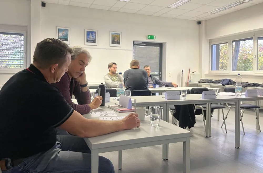
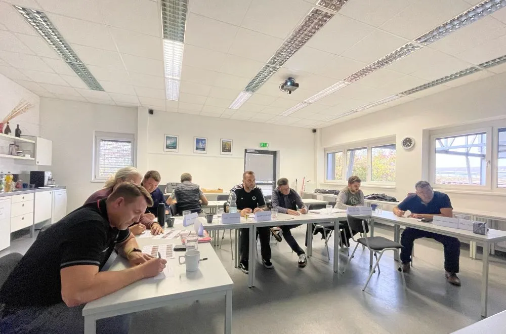
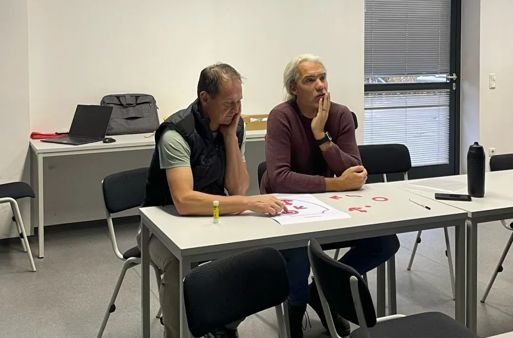
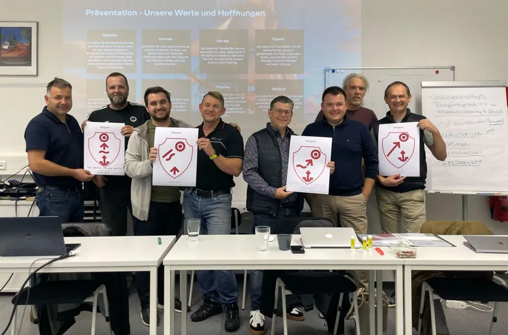
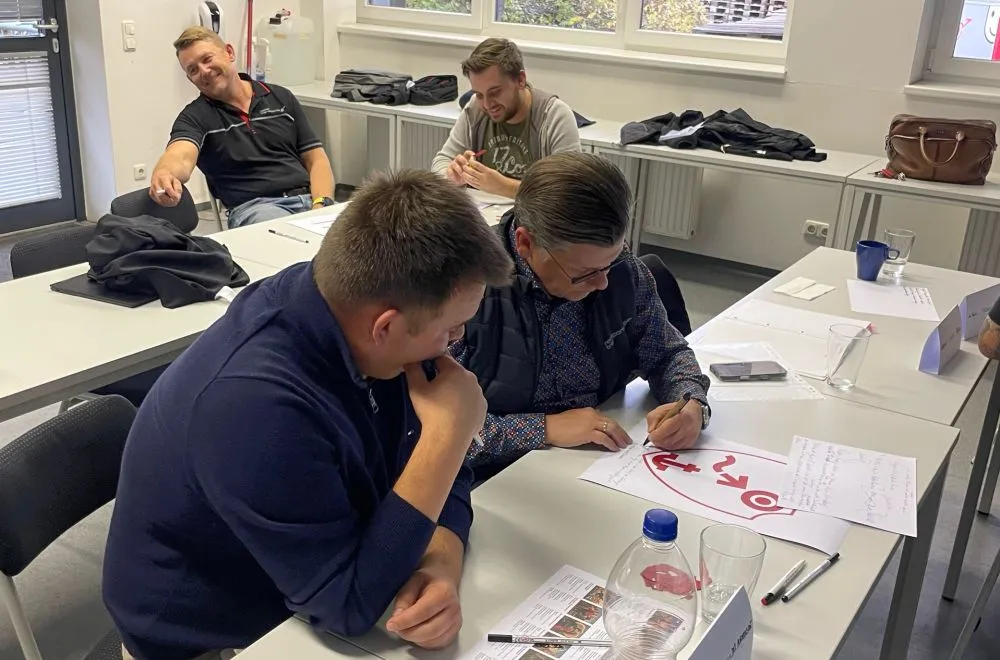
A particularly formative moment was our final brand workshop – a metaphorical hero’s journey with a sailing ship. This image accompanied us throughout the entire process: a ship needs direction, a crew, trust and a shared goal. Everyone carries responsibility, and only through interplay does movement arise. It was precisely this understanding that helped us to consciously shape our brand and to make visible what connects us.
The symbolism of this journey stood for orientation, togetherness and shared development. It made tangible that a strong brand does not arise from the outside, but grows from within – carried by people who take on responsibility together and steer in the same direction. This experience became the basis of our new visual identity.
The new visual identity
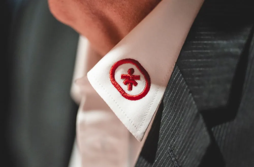
From this shared work, more than a design emerged. The new signet was defined in the workshop itself – as a symbol of path, direction and goal. It stands for movement, clarity and orientation. The typography combines modern clarity with our long tradition and creates a visual language that is at once calm, precise and contemporary.
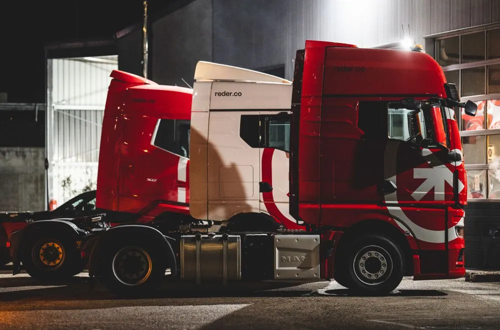
Our vehicle design also deliberately takes up an element from our past: a light shade of gray that was already part of our identity in earlier times and will once again form the base color of our fleet in the future. This creates a visible connection between origin and future – familiar and yet newly interpreted. Every detail of our visual identity helps to make our attitude visible: clear, consistent and focused on the essentials.
A brand for the future
With REDER Transportlogistik++, we have created a basis that will accompany us long term: modern, clear and unmistakable. The new brand stands not only for a visual appearance, but for a shared understanding of responsibility, cooperation and development. It connects people, provides orientation and gives our shared future a clear form.
From 2026 onwards, a large part of our vehicles will be on the road in the new design – visible, consistent and as a sign of our shared future. Step by step, our brand becomes tangible in everyday life, in the visual appearance as well as in our joint actions.
Our brand did not come into being anew. It has grown – carried by experience, shaped by people and now become visible.
Next insight
When reliability counts, we are ready.
Our experts stand for clear answers and individual solutions. Personal, uncomplicated and with the aim of simply making logistics better.
